
Crafting Brand Identity With Social Media Video Colors
In the sphere of social media marketing, colors wield a profound influence, resonating with emotions and shaping perceptions.
From the soothing shades of blue that evoke trust and serenity to the vibrant hues of orange that communicate energy and enthusiasm, every color utilized by a social media video creator carries a sliver of psychology and a dash of strategy.
Brand identity is not merely etched through logos and slogans; it pulses vividly through the very palette that colors each video, animation, and infographic shared across platforms like YouTube Shorts and Meta.
The judicious selection of color can elevate a brand’s message, fortify its personality, and forge an indelible connection with its audience.
In this article, we’ll uncover the incredible power of color in crafting a brand’s identity through social media videos.
Key Takeaways
- Color in Social Media Marketing Holds Psychological Power, Shaping Consumer Behavior and Brand Perception
- Social Media Video Creators Must Adapt Color Schemes to Align With Platform-Specific Audiences and Environments
- Consistent Color Usage Across Different Content and Platforms Reinforces Brand Identity and Recognition
- Color Trends Reflect Societal and Cultural Shifts, Influencing Brand Relevance and Audience Engagement
- Strategic Use of Analytical Tools and User Feedback Is Key to Understanding Color’s Impact on Social Media Video Performance
Understanding the Impact of Color in Social Media Videos

Within the realm of digital marketing, harnessing the power of color is not simply a matter of aesthetic pleasure; it is a strategic tool to convey a brand’s core message and engage its target audience on a deeper psychological level.
Social media video creators meticulously select palettes that resonate with the brand’s identity and the emotions they aim to evoke.
From the tranquility of azure skies to the vibrant energy of a neon orange, each hue carries its own weight in shaping consumer perception.
As marketers navigate the ever-evolving landscape of online advertising, comprehending color psychology becomes pivotal in distinguishing a brand amidst the sea of competitors.
Furthermore, staying abreast of emergent color trends allows brands to craft content that is not only visually magnetic but also culturally and contextually relevant, elevating their presence in the bustling world of social media.
The Psychology Behind Color Choices
In the pantheon of digital communication design, color is not a mere decorative element; it is an embodiment of language itself, speaking to the subconscious and influencing behavior in subtle yet profound ways. When a social media video creator selects shades of blue, they may not just be tapping into the serenity of the ocean’s depths or the reliability linked with traditional corporate hues but leveraging the universal affinity for the expansive sky or the trust engendered by a police officer’s uniform. Conversely, the zest of citrus yellow or the aggression suggested by a splash of red can galvanize action, not just reflect the sun’s brightness or symbolize a warning sign.
How Colors Can Enhance Brand Recognition
In the competitive theater of social media marketing, a brand’s choice of color scheme can act as a visual shorthand, encapsulating its essence and enhancing recognition. A social media video creator might employ a distinct palette, like the cool sophistication of navy blue or the warmth of a sunset magenta, ensuring that with each viewing, the audience subtly cements the association between these colors and the brand’s identity. Thus, through strategic color utilization, companies can anchor their image in the minds of consumers, transforming mere viewers into brand ambassadors.
Interpreting Color Trends in Social Media Content
Color trends in social media content are more than fleeting fashions; they are a reflection of the collective mood and sociocultural shifts. A savvy social media video creator pays close attention to these evolving preferences, selecting combinations that resonate with the cultural zeitgeist and project the brand’s relevance:
- An uptick in pastel hues might align with a growing preference for mindfulness and wellness,
- a surge in neon palettes can echo a communal hunger for vibrancy and escape,
- while the embrace of earth tones could signify a collective yearning for grounding and stability.
Diligent research into color trends empowers marketers to infuse their content with visual cues that capture the zeitgeist, fostering a sense of immediacy and connection with the target audience.
Now that we’ve explored the profound influence color wields in social media videos, let’s shift focus. Prepare to delve into real-world examples as we dissect how top-tier brands harness these hues for captivating their audiences.
Analyzing Successful Brands’ Use of Color in Social Media Videos
In the bustling arena of social media, colors do more than dazzle; they narrate a brand’s story and predetermine its place in the consumer’s world.
Intentional color choices by tech giants often trend towards sleek monochrome indications of sophistication, while lifestyle brands paint their canvas with an array of shades that mirror the vivacity of living.
Luxury brands, veering off the vibrant track, might harness the stark power of black and white to evoke timeless elegance.
Each sector leverages color in strategic ways that go beyond mere decoration, blurring the lines between visual appeal and psychological influence.
Diving into several case studies, we observe how successful brands across various industries deploy color as a seminal component of their visual identity, fostering brand recognition, affirming their message, and engaging users with the artful science of color psychology.
Case Study: The Dynamic Use of Color by Leading Tech Brands
Meta Platforms exemplifies the strategic deployment of color within the tech industry, using hues that not only enhance usability but also fortify user connections. Their sophisticated palette, centered around a calming yet powerful shade of blue, underpins the brand’s narrative of connectivity and trust. Simultaneously, Meta’s judicious use of complementary colors in their user interface promotes an intuitive experience, reflecting an understanding of color theory application in reinforcing brand identity and ease of use on a mobile device.
Case Study: How Lifestyle Brands Utilize Color Palettes
Lifestyle brands distinguish themselves in the digital arena by orchestrating color palettes that encapsulate not only their products but the very essence of the lifestyle they promote. Take, for instance, a fashion house that punctuates its social media videos with bursts of violet and shades of green, colors traditionally associated with luxury and growth, to craft an image of affluence and vitality. Through such visual symbology, these brands skillfully weave their narrative into the consumer’s daily life, making a profound impact on brand awareness and personal identity formation.
Case Study: The Innovative Use of Black and White by Luxury Brands
Luxury brands often defy conventional color norms, opting instead for the stark simplicity of black and white to convey their message. By stripping away the distraction of multiple colors, these brands utilize the contrast and clarity of monochromatism to create a bold statement of elegance and exclusivity. This strategic choice accentuates the sophistication inherent in the brand, fostering an atmosphere of timeless luxury that resonates with a discerning audience.
Having delved into how top brands harness color to captivate their audience, let’s pivot to crafting your brand’s visual allure. Ready your palette; it’s time to choose the colors that will define your brand’s video storytelling!
Selecting the Perfect Color Scheme for Your Brand’s Videos

In the dynamic spectrum of social media videos, a meticulously chosen color scheme serves as the silent ambassador of a brand’s personality.
Bold, bright tones may exemplify a brand that prides itself on vivacity and innovation, whereas subdued, earthy colors could reflect a commitment to sustainability and natural beauty.
Beyond simply catching the eye, the right colors convey the brand’s narrative, imbuing each frame with the power to tell a story without uttering a single word.
Recognizing the critical importance of color consistency, savvy marketers turn to innovative tools and resources designed to ensure that every hue and gradient is aligned with the overarching messaging strategy, solidifying the brand’s visual identity across various platforms and campaigns.
Matching Color Schemes With Brand Personality
Perfect harmony between brand personality and color scheme is non-negotiable for a social media video creator intent on making a mark. A carefully curated selection of colors can act as a bridge between the brand and its intended audience, subtly communicating values and ethos. Whether it’s the professionalism imbodied in shades of grey, the youthful exuberance of a vibrant turquoise, or the innovative spirit of a bold magenta, the chosen palette becomes a visual manifestation of the brand’s character, influencing consumer engagement and brand affinity.
The Role of Color in Storytelling and Messaging
In the art of visual communication, color is a pivotal storyteller, setting the stage for a brand’s message to unfold. It paints context and emotion, guiding the viewer’s journey through the narrative arc of the advert: from the initial hook to the climactic call to action.
| Color Role | Emotional Trigger | Brand Message |
|---|---|---|
| Warm hues of orange and yellow | Happiness, Optimism | Depicting a brand that’s youthful and energetic |
| Bold red | Excitement, Passion | Highlighting the brand’s dynamic, action-oriented approach |
| Cool tones of blue and green | Trust, Growth | Conveying stability and reliability, fostering trust in the brand |
| Elegant black and white | Sophistication, Simplicity | Positioning the brand as premium and timeless |
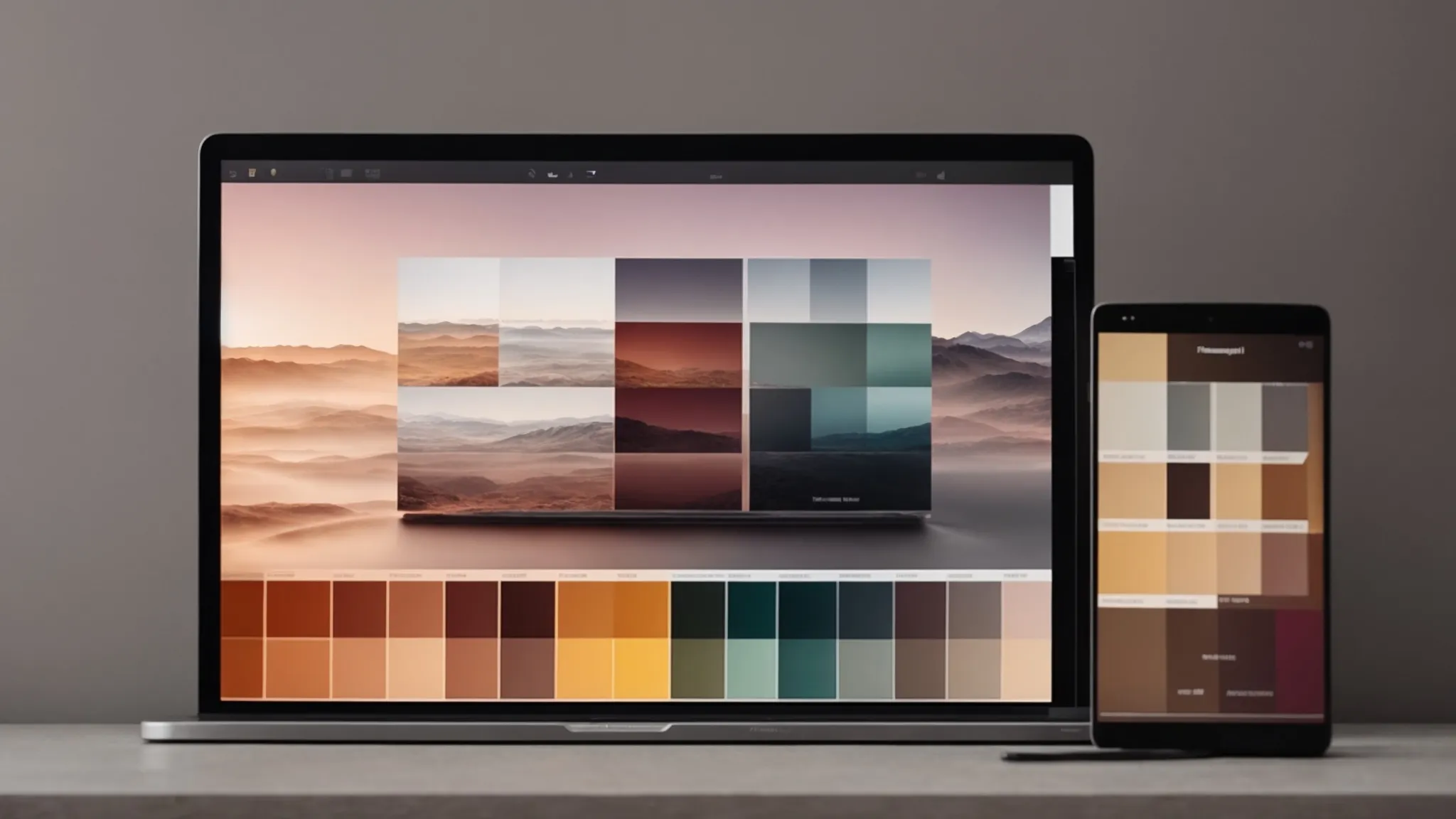
Tools and Resources for Creating Consistent Color Palettes
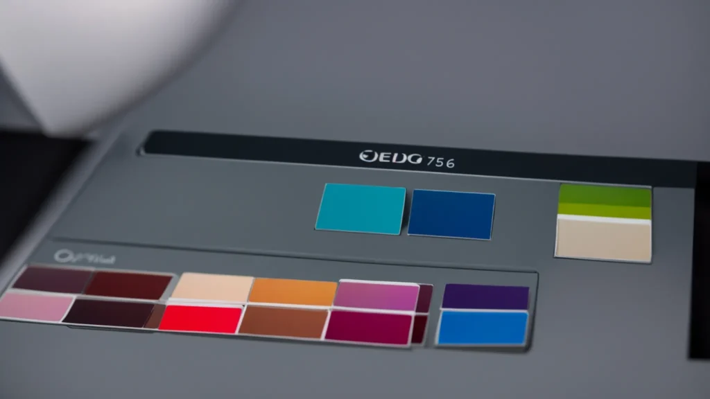
For social media video creators aiming to maintain brand identity across platforms, utilizing digital tools and resources that manage color palettes is indispensable. Software like Adobe Color, Coolors, and Paletton enable creators to develop and preserve color consistency, empowering the establishment of a cohesive visual language that speaks volumes about the brand’s character and integrity.
| Tool | Functionality | Benefit for Brand Identity |
|---|---|---|
| Adobe Color | Color scheme creation and theme sharing | Ensures harmonious palettes that align with brand messaging |
| Coolors | Palette generation and adjustment | Streamlines the development of brand-specific color schemes |
| Paletton | Color relationship visualization | Fosters an intuitive understanding of color dynamics for storytelling |
Understanding the power of colors opens doors to deeper connections with your audience. Let’s harness this knowledge and dive into how color psychology can amplify your social media strategy.
Integrating Color Psychology Into Your Social Media Strategy

In the fast-paced arena of social media marketing, establishing a distinctive brand identity demands a sophisticated understanding of color psychology.
Far from arbitrary, the selection of colors serves as the linchpin for transmitting a brand’s essence and cultivating the desired emotional response from the audience.
Tapping into this powerful psychological phenomenon involves identifying which colors trigger specific emotions, achieving the delicate balance that simultaneously captures attention and provides visual comfort, and thoughtfully creating moods through purposeful gradients and combinations.
Each palette choice a social maker video creator makes is a strategic decision, a step towards crafting a subtle yet persuasive narrative that resonates with viewers on an emotional level.
Identifying Which Colors Evoke Desired Emotions
At the heart of a successful social media marketing campaign lies the adept use of color to evoke specific emotions in the audience. The strategic deployment of a color can tap into the depths of human psychology, prompting feelings of excitement, trust, or serenity: red may infuse a sense of urgency or passion, while a soothing blue fosters tranquility and promotes confidence.
- Red stirs excitement and passion, ideal for call-to-action messages.
- Blue exudes trust and calm, often used by financial institutions to build confidence.
- Green represents growth and health, aligning with ecologically-conscious brands.
- Yellow radiates optimism and warmth, capturing the attention of youthful demographics.
- Purple suggests creativity and luxury, suitable for innovative or high-end products.
Balancing Color for Attention and Comfort
Achieving a harmonious balance between capturing attention and offering visual comfort is a delicate task that a skillful social media video creator must master. This balance requires a calculated mix of colors that stand out without overwhelming the viewer, maintaining engagement while also creating a pleasing aesthetic experience.
- Identify contrasting colors that draw the eye, but complement them with subdued tones to mitigate visual fatigue.
- Implement a color hierarchy in the video’s design to guide the viewer naturally through the content.
- Utilize occasional bursts of bold color to highlight key messages, ensuring they remain anchored in the viewer’s memory.
Creating a Mood With Color Gradients and Combinations
Gradients and color combinations are not mere artistic choices; they are strategic elements in video creation, used adeptly by social media video creators to craft atmospheres that resonate emotional connectivity. The thoughtful transition from a deep sapphire to a gentle sky blue can simulate a serene progression in the viewers’ emotions, while the deliberate juxtaposition of complementary hues, such as a vivid lime against magenta, can produce a dynamic, invigorating effect that accentuates key moments within the narrative:
- Gradient shifts might suggest a transition, a dawn of new ideas, or the softening of a message.
- Complementary color combinations strategically emphasize content highlights, guiding the viewers’ attention to critical moments.
- The interplay between warm and cool palettes can balance the mood, crafting a visual journey that aligns with the story’s arc.
Dive deeper into the digital palette and elevate your online presence. Next, we’ll unveil how adept use of color transforms your engagement across varied social media landscapes.
Mastering the Use of Color in Various Social Media Platforms

As social media platforms diversify, so too must the strategic use of color in content.
Each channel offers a unique environment and audience, requiring a tailored approach to visual presentation.
For Instagram, a particular palette enhances visual storytelling, catering to its visually-driven community.
TikTok’s fast-paced platform demands vibrant, attention-grabbing colors that resonate with its dynamic audience.
Meanwhile, LinkedIn’s professional context calls for a subtler color scheme, reflecting its corporate atmosphere.
Mastering these adjustments allows brands to effectively communicate their identity and message across the varied landscapes of social media.
Tailoring Colors to Fit Instagram’s Aesthetic
Instagram’s tapestry of visual media demands an aesthetic that tells a brand’s story through a curated color narrative. Brands seeking to captivate this platform’s audience must harness the subtle textures of their color scheme, ensuring that each image and video resonates with the platform’s penchant for stylized photography and design. By deftly molding their palettes to align with Instagram’s aesthetic, brands can weave a visual identity that is not only consistent but also deeply entrenched in the user’s experience of their feed.
Utilizing Vibrant Colors for TikTok’s Dynamic Audience
On the pulsating stage of TikTok, where the zest for life is matched by the rapid scroll of thumbs, utilizing vibrant colors is not just an aesthetic choice – it is a strategic imperative. Brands adept at capturing TikTok’s dynamic audience harness a spectrum of vivid colors to grab attention amidst a flux of fleeting content: a splash of electric blue to evoke energy, shocks of radiant pink to convey playfulness, or streaks of brilliant yellow to inject cheer. This strategic use of vibrant colors proves essential in crafting memorable, engaging content that resonates with TikTok’s youthful and vigorous viewership.
- Electric blue, employed to generate a sense of dynamism and vigor.
- Radiant pink, chosen for its playful connotations and appeal to a fun-loving demographic.
- Brilliant yellow, used to infuse content with an aura of positivity and vibrancy.
Adapting Colors for Professionalism on LinkedIn Videos
On LinkedIn, where professional discourse prevails, color usage in video content adopts a more understated palette, often favoring cool hues like navy blue or forest green that communicate a sense of authority and composure. These carefully chosen colors project the brand’s professionalism and align with the platform’s sophisticated environment, reinforcing the credibility and earnest message the brand intends to convey to its network of professionals.
With a newfound mastery of color under our belts, it’s time to shift focus to the analytics of aesthetics. Let’s unveil the secrets behind gauging the impact of your carefully chosen palette on viewer engagement.
How to Measure the Effectiveness of Color in Your Videos

Navigating the intricacies of visual engagement requires more than intuition; it demands a strategic approach to validate the efficacy of color in social media videos.
Marketers must delve into analytics, scrutinizing engagement metrics to determine how color influences viewer behavior.
A/B testing emerges as a crucial method, comparing different color schemes to see which resonates most powerfully with the audience.
Additionally, directly soliciting audience feedback offers invaluable insights into color preferences, enabling brands to refine their visual strategy and ensure their message not only reaches but truly connects with their intended demographic.
Tracking Engagement Metrics Related to Color Use
Discerning the success of a social media video’s color scheme involves interpreting data with exactitude. By meticulously reviewing engagement metrics such as view duration, shares, and comments, marketers can quantify the allure of specific color choices. This investigation allows creators to hone in on the color combinations that truly captivate their audience, subsequently bolstering brand identity and user interaction.
A/B Testing With Different Color Schemes
A/B testing with different color schemes employs a methodological approach to assessing viewer preferences and behaviors. By presenting alternate versions of the same content, distinguished primarily by varying color compositions, brands receive data-driven insights, allowing them to pinpoint which palette increases viewer engagement and drives the desired action on social media platforms.
–
| Version | Color Scheme | Engagement Metrics Observed | Viewer Behavior |
|---|---|---|---|
| A | Brights and Neons | Click-through rate, Likes, Comments | Increased curiosity and interaction |
| B | Earth Tones and Pastels | Watch time, Share rate | Longer viewing duration, higher shareability |
Gathering Audience Feedback on Color Preferences
To truly tap into the heart of audience patterns, brands must extend beyond pure analytics and invite direct discourse with their viewers: they should collect and analyze feedback on color preferences. This conversation enables marketers to discern particular shades that elicit positive responses or identify hues that may need reevaluation, ensuring the visual components of a brand’s videos are attuned to the preferences of their audience.
By conducting surveys, leveraging social media polls, or examining the emotional reactions to video content, brands can amass a wealth of knowledge directly reflective of their target demographic’s tastes in color:
| Feedback Method | Color Preferences Identified | Adjustments & Strategic Takeaways |
|---|---|---|
| Surveys | Preferences towards cool color palettes for trust | Integrate more blue and green tones into future videos |
| Social Media Polls | Attraction to vibrant, high-energy colors | Utilize bright reds and yellows to elevate energy levels |
| User Comments and Reactions | Positive response to pastel color schemes | Investigate incorporating the pastel trend into the brand’s palette |
As you harness the vibrant power of color to captivate your audience’s attention, the pursuit of visual excellence never ends. Next, let’s breathe new life into your brand’s color identity to ensure it remains as dynamic and engaging as the content you create.
Keeping Your Brand’s Color Identity Fresh and Relevant

In the ever-changing tapestry of the digital marketing world, a brand’s color palette is a dynamic entity, signaling evolution while maintaining the essence of its identity.
To remain visually compelling and emotionally resonant, brands must discern when and how to refine their color choices, ensuring they align with emerging trends and audience preferences.
This delicate balancing act involves integrating seasonal hues that reflect the time’s spirit without diluting the core identity that consumers have come to recognize.
Embracing such versatility and foresight positions a brand at the forefront of its industry while cultivating a visual language that evolves with its audience.
When and How to Evolve Your Color Palette
As a brand matures and societal trends shift, the evolution of a color palette becomes necessary to sustain relevance and emotional connectivity with the audience. Implementing subtle transformations, such as introducing accent colors that reflect current tastes or gradually shifting the primary colors to more contemporary hues, can rejuvenate a brand’s visual identity. This strategic refinement, guided by ongoing analytics and consumer feedback, ensures that the brand’s visual messaging remains vibrant and engaging without losing the recognition and trust it has built over time.
Staying Ahead of Color Trends Without Losing Brand Identity
To maintain a competitive edge, brands must deftly traverse the fluid terrain of color trends, incorporating new hues that reflect the zeitgeist while safeguarding their enduring identity. It’s a conscious interplay where innovation meets nostalgia, as companies infuse contemporary shades into their established palette, crafting an evolving but recognizable brand persona that continues to speak the consumer’s language and encapsulate its heritage.
Incorporating Seasonal Color Variations in Your Strategy
Embracing seasonal color variations is akin to speaking the visual vernacular of the times: it showcases a brand’s agility in adapting to the transient moods of nature and society.
| Season | Color Inspiration | Brand Strategy |
|---|---|---|
| Spring | Fresh greens, floral pastels | Introduce rejuvenating visuals that reflect renewal and growth |
| Summer | Vibrant blues, sunny yellows | Inject energy and warmth to echo the vibrancy of the season |
| Autumn | Earthy oranges, deep reds | Adopt a palette that resonates with the cozy, reflective atmosphere |
| Winter | Cool blues, crisp whites | Shift to calming hues symbolizing clarity and a fresh slate |
Maintaining a cohesive color identity is a vital piece of the branding puzzle. Let’s shift our focus and tackle the trials of ensuring color consistency across the diverse landscapes of digital platforms.
Overcoming Challenges in Consistent Color Branding Across Platforms
In the theater of social media, brand identity is inextricably tied to the visual symphony of colors that dance across the audience’s screens.
Achieving consistency in this aspect demands more than a keen eye for design; it is a complex challenge involving adaptation to diverse formats, varied lighting conditions, and the unpredictable variables of online platforms.
Exceptional social media video creators understand the nuance of aligning video content color with overall brand visuals, transforming potential pitfalls in color representation into opportunities to solidify brand recognition.
Goal-oriented and meticulous, these creators navigate the multifaceted landscape of digital display, ensuring that color remains a steadfast envoy of brand identity whatever the environment.
Ensuring Color Consistency in Various Lighting and Formats
Ensuring color consistency across various lighting conditions and formats remains a pivotal aspect of brand identity for social media video creators, who strive to mitigate disparities that arise when content is consumed on different devices and environments. By calibrating their editing processes and pre-testing color rendering on multiple screens, creators effectively preserve the integrity of their brand’s color palette, irrespective of the medium through which it’s viewed, thus maintaining a cohesive visual narrative.
Aligning Video Content Color With Overall Brand Visuals
Aligning video content color with overall brand visuals is about crafting a seamless visual storyline that resonates across all customer touchpoints. Creators adept in social media video design understand that consistency in coloration not only strengthens a brand’s visual appeal but reinforces its identity in the collective memory of its audience.
| Platform | Engagement Goal | Color Strategy |
|---|---|---|
| Storytelling | Curated, brand-specific color palettes | |
| YouTube | Educational Content | Clean, focused backgrounds with brand colors |
| Community Building | Consistent use of brand colors in images and videos | |
| TikTok | Energetic Engagement | Bold, contrasting colors aligned with brand energy |
| Professional Networking | Subdued color schemes reflecting corporate branding |
Solving Common Pitfalls in Color Representation Online
Navigating the hurdles of online color representation necessitates a blend of strategic foresight and technological know-how. Social media video creators refine their content for optimal color fidelity by employing sophisticated software tools that account for varied color spaces and monitor calibration techniques, resulting in a consistent portrayal of brand colors that maintains integrity and visual impact across the vast digital landscape.
The landscape of consistent color branding is ever-evolving, and pioneering brands are already setting their sights on what’s next. Let’s pivot our attention to the horizon and uncover the emerging trends in color usage for social media branding.
Future Trends in Color Usage for Social Media Branding
As the digital marketing sphere perpetually evolves, the importance of color in crafting a brand’s social media identity remains an ever-present pillar of visual strategy.
Anticipating the next wave of color trends in social media content is essential for staying relevant and capturing audience interest.
With the emergence of augmented reality (AR) technologies, brands are exploring new frontways to make their colors not only seen but interacted with, leading to unparalleled levels of engagement.
Additionally, social media algorithms continue to evolve, subtly dictating the color choices that brands employ to maximize visibility and impact.
These facets of social media branding are rapidly shaping the future, urging marketers to adapt and innovate in an environment enthusiastic for color-induced engagement.
Predicting Upcoming Color Trends in Social Media Content
As social media platforms unveil new features that accentuate visual content, forecasters anticipate a surge in the use of immersive color experiences to captivate users. Evolving user interfaces and the increased prevalence of high-definition displays will likely spark a shift towards color schemes that maximize screen technology, giving rise to a blend of both saturated and nuanced shades designed to engage users with striking, memorable interactions.
The Rise of Augmented Reality and Color Interactivity
The advent of augmented reality (AR) is revolutionizing the way brands think about color interaction on social media. With this cutting-edge technology, influencers and brands are unlocking a new dimension of user experience by enabling viewers to not only see but also interact with a spectrum of colors in real-time, fostering a deeper and more immersive connection with the brand’s identity and messaging.
How Evolving Social Media Algorithms Influence Color Choices
In the intricate dance of algorithms and user engagement, color remains a vital part of the equation. As algorithms become more sophisticated in promoting content, they can discern and prioritize videos based on color vibrancy and contrast, which in turn influences viewer engagement and retention rates. Brands, therefore, need to adapt their color choices strategically to navigate these algorithmic tendencies, ensuring their content remains prominent and appealing in users’ feeds.
- Brands must consider algorithmic preferences for vibrant and contrasting colors that enhance content visibility.
- Adapting color choices based on algorithmic changes ensures high engagement and retention rates for videos.
- Strategic color adaptation is necessary to maintain content prominence on ever-evolving social media platforms.
Conclusion
Crafting a brand identity on social media hinges on strategic color usage, shaping viewer emotions and reinforcing brand recognition.
Social media video creators leverage color psychology to tell compelling brand stories and prompt specific viewer behaviors.
Consistency across various platforms in color representation ensures a seamless brand experience, solidifying audience connection.
As social media evolves, staying attuned to color trends and algorithm preferences is crucial for maintaining engagement and a fresh, resonant brand identity.